Memphis Meltdown launches brand and packaging refresh via Interbrand New Zealand
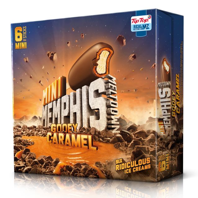
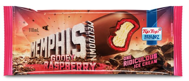
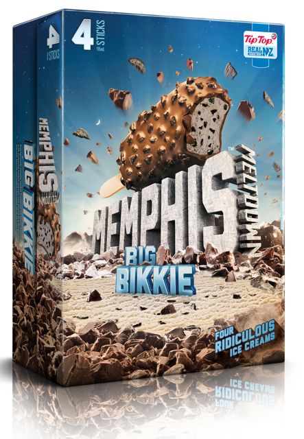
 Interbrand New Zealand is responsible for a refresh of the Memphis Meltdown brand and packaging, appealing directly to its target market and the ‘Memphis Crave’.
Says Simon Byers, Interbrand design director: “We wanted the designs to convey the big, ridiculous proportions of the product so we created an out-of-this-world land of Memphis full of chocolate and big chunks of fun.
“It was about creating the Memphis crave on pack – to make the consumer look at it and want to eat it. Because it is the biggest ice cream on a stick in the market, we came up with the idea of it being ‘bigger than Ben Hur’.”
 Memphis Meltdown was launched in September 1997 and was positioned as a down-to-earth ultimate indulgence. In 2005, the brand was repositioned to deliver a no-holds-barred eating experience with the introduction of the
  Memphis Meltdown Big Nuts. Now the’bigger than Ben Hur’ logo appeals to the Memphis target market with the strength and solidness of the monolithic structure.
The Memphis Meltdown range of products was launched into the New Zealand market in August 2013.
Client: Fonterra Brands (Tip Top Ltd)
Group Marketing Manager: Minna Reinikkala
Senior Brand Manager: Simone Reeh
Agency: Interbrand
Design Director: Simon Byers
Senior Designer: Manuel Payan
Artwork Production: Simon Moen
Account Director: Michelle Stoupe
