Science leads to rebrand of Hanmer Springs Thermal Pools and Spa via Harvey Cameron
 When the team at Hanmer Springs Thermal Pools and Spa received a scientific analysis of the complex’s natural thermal waters, they knew it was something to celebrate.
General manager Abbot took the research into Harvey Cameron, one of New Zealand’s leading creative businesses, which has worked alongside the pools for more than a decade.
 Abbot says the results were eye-opening: “We always knew our water falls as rain before making its way to underground resorvoirs where it’s warmed by heat from the earth’s core but this analysis showed for the first time that that process takes 173 years and leaves the water rich in minerals and bathing salts that have therapeutic benefits.
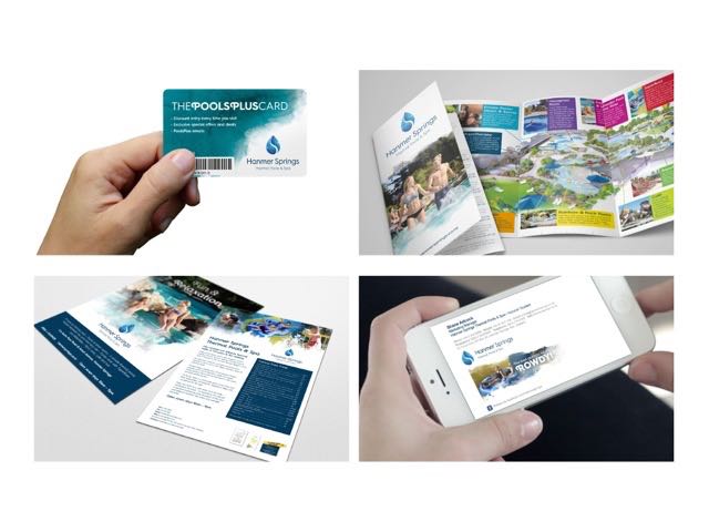
“It is amazing to think about… the water that comes out of our bore today fell as rain in 1842 – just two years after the Treaty of Waitangi was signed! We wanted everyone else to know the story behind the thermal water too.”
So what did they decide was the best way to share how special their water is? By completely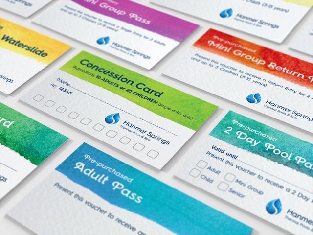 rebranding and making sure their water took pride of place in the new look.
Says Abbot: “We were about to start an overdue rebranding process and the research gave us inspiration to ensure our thermal water was at the heart of that.”
Managing director Neil Cameron says his creative team immediately saw the potential for water to be the essence of the new brand and they wanted to ensure that what was created had depth.
Says Cameron: “I’ve had a love affair with Hanmer Springs for a 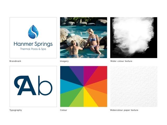 long time – my wife and I married there and the village is still one of our favourite places. Because we’ve been there so often and our team’s worked alongside the pools in strategically planning and bringing to life some of their biggest developments we knew intimately what the brand had to convey.”
Alan Kang, head of design at Harvey Cameron says the new brand had to reflect the multi-layered 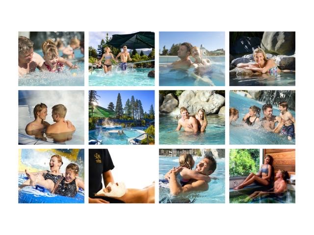 personality of the pools.
Says Kang: “It’s a place of boisterous fun but also of indulgence and relaxation. It’s buzzing on the weekends but quieter mid-week. There is colour and vibrance in summer but it can be very steamy and dark at night. It’s a superb place to unwind but also a great place to wind up the kids…there are a lot of experiences.”
Because of that, the creative team decided ![]() that the brand had to have some depth to it and the experimentation began.
that the brand had to have some depth to it and the experimentation began.
Says Kang: “We looked at a variety of executions but things really started to take shape when we started playing with watercolour paints and seeing how they formed and reacted on paper.
“All of sudden we had textural elements that brought a richness to the concepts – and the irony that we were 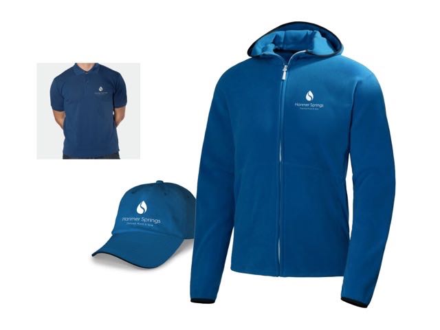 creating them with water wasn’t lost on us.”
As time progressed, the team, using the water colour paint effects, created a styalised droplet of water with two halves that are gently seperated by a swirl.
Says Kang: “To us the droplet symbolises the thermal water that is the lifeblood of the organisation and the two halves represent the business’ two core 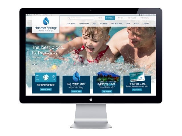 functions: fun and relaxation. But what’s been great is hearing how other people interpret the device. Some have likened it to yin and yang, others to the thermal water rising up from the earth and others to a river and mountains.”
As with any major brand, the logo is just the beginning and the Harvey Cameron team has created a suite of other tools that embody the essence of the organisation.
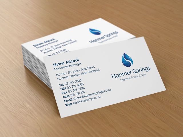 Says Kang: “We’ve extended the colour palette to include some more rich and vibrant tones, created new icons to showcase specific products and refined the visual language of the brand, such as the textural treatment of images, which all helps to enhance the look and feel.”
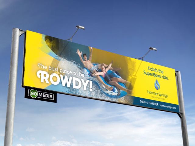
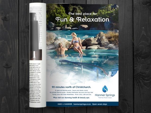
Abbot says his team is delighted: “It looks great everywhere – on billboards, on uniforms, online and on signage. 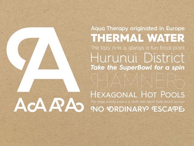 What’s wonderful for us is that it really showcases who we are and gives us an opportunity to talk about the water and tell the 173 year old story… loudly and proudly.”
![]()
2 Comments
“Harvey Cameron, one of New Zealand’s leading creative businesses…”
Got to love an agency press release.
While they’ve had a crack at design, the research insight is totally lost! Guess that’s what happens when you quietly ‘restructure’ to try and stay on top of agency profitability, but lose quality integrated thinking.
Looks like it’s time they passed the torch on in Christchurch!
Gotta love they put their client’s contact details up as one of the examples of business card execution!