Latitude kickstarts next growth phase with redesigned brand via Lippincott
Global brand, marketing, and experience consultancy Lippincott has partnered with Latitude, a leading consumer finance business in Australia and New Zealand, to create a dynamic, modern brand identity and scalable toolkit designed to support the company’s growth strategy.
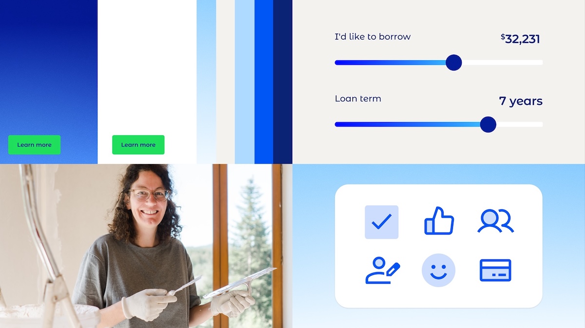
The refreshed brand simplifies and strengthens Latitude’s visual and verbal system, enabling brand consistency for teams across the company developing marketing assets to support key business goals, including acquisition, engagement and growth across its core lending products, which include credit cards, personal loans and auto loans.
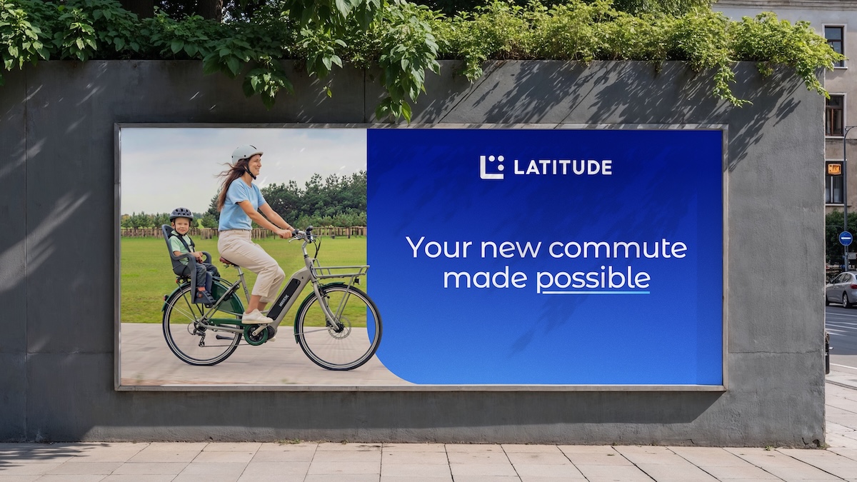
The work builds on Latitude’s existing unifying idea, “Latitude makes it possible,” evolving the brand to better reflect the needs of today’s credit customers, as well as the merchants and brokers it partners with. Grounded in audience insight, the new identity centers on the expectations of Latitude’s core customer base: “Middle Australia and New Zealand” – savvy, everyday borrowers who value transparency, control and communications that feel clear, dependable and easy to engage with.
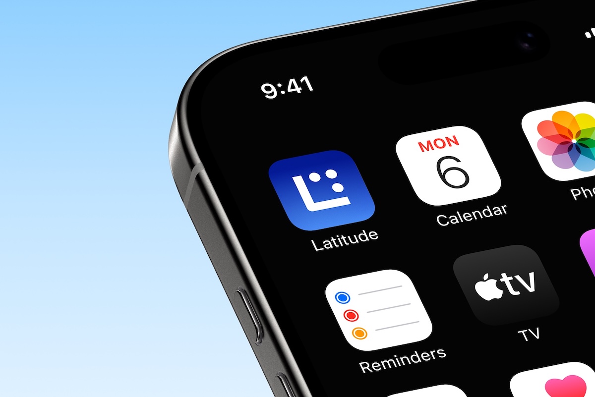
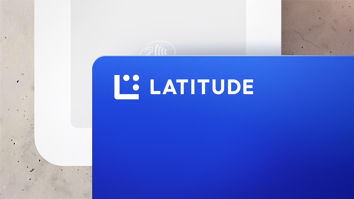
As part of the work, Lippincott redesigned the logo, including three new ‘possiballs’ designed to reflect the possibilities Latitude creates for customers. The refreshed design promotes an easily accessible digital look with embedded “L” features that represent the brand’s heritage branding and a bold, uppercase logotype to showcase clarity and confidence.
Since 2023, Latitude has refocused on its core segments and markets in Australia and New Zealand and streamlined operations, creating renewed business momentum that the previous identity no longer fully reflected. The updated brand reflects a more modern approach to appeal and drive stronger connection with a broader customer base.
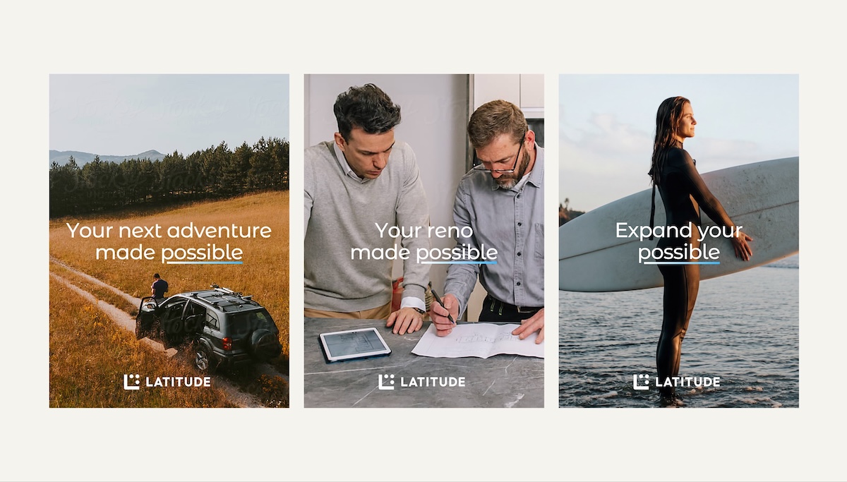
Alongside the strategic repositioning, Lippincott developed a cohesive and flexible brand system built to deliver impact in market. The toolkit enables brand consistency across channels and teams, including by non-designers, helping Latitude scale its brand expression efficiently as the business grows.
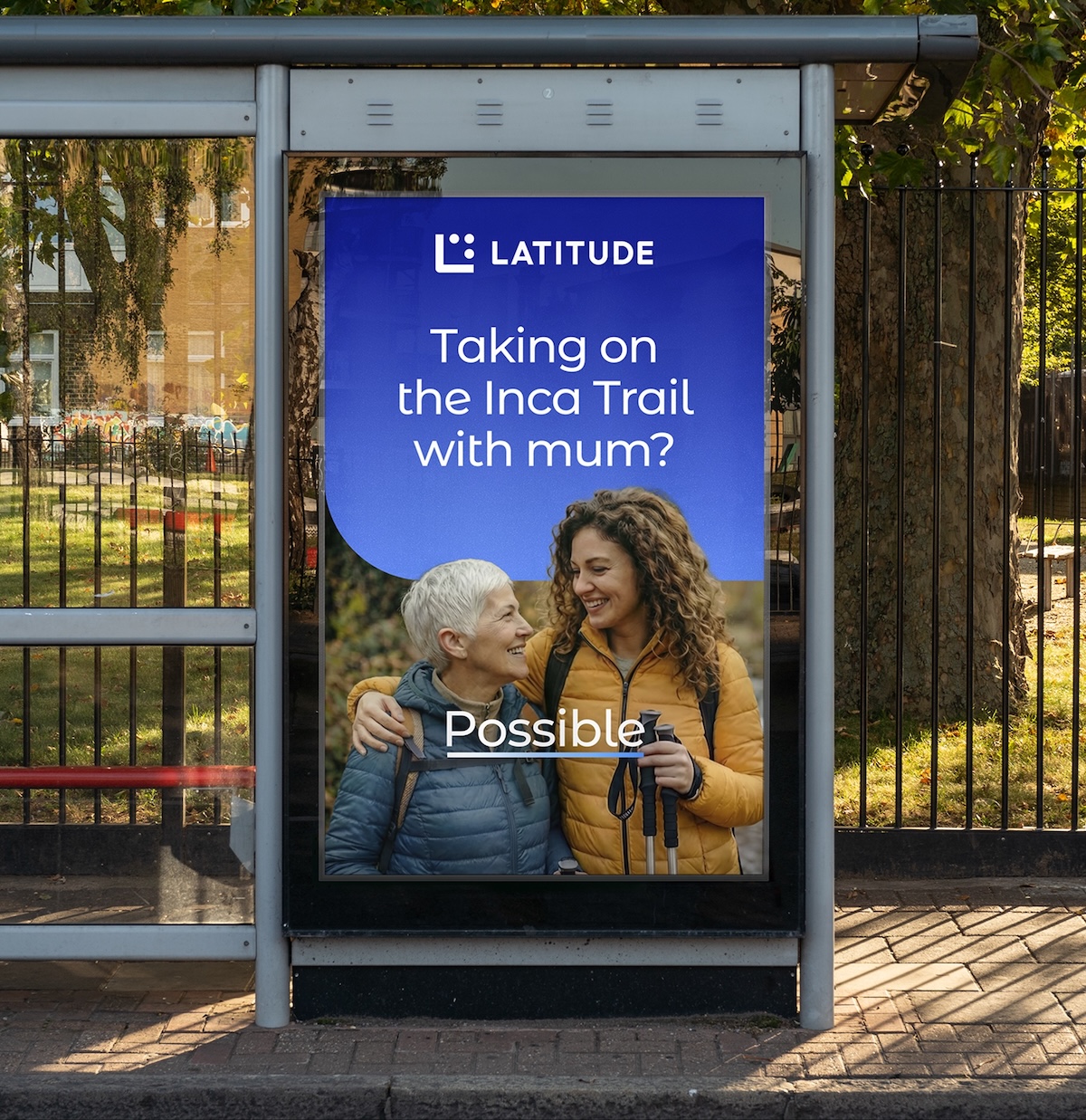
The new brand maintains Latitude’s established brand colors, keeping blue as the anchor color, but with a simplified tonal palette, removing competing pastels and focusing on gentle gradients. The new typography, Latitude Sans, uses bespoke numerals with rounded terminals to mirror the visual identity. The new identity is purpose-built for a decentralized marketing model, enabling non-designers to deploy the brand consistently at scale through modular components, accessible UI choices for digital experiences, and photography that captures authentic customer moments.
Says Graham Harvey, Senior Partner at Lippincott: “Latitude is a modern, dynamic lender – data led, digitally native, and united by a clear purpose: making it possible for everyday Australians and New Zealanders to get more from their finances. The new brand serves to translate that foundation into a clear, modern identity built to scale. The result is a distinctive, flexible system while making the brand feel more accessible to the brand’s core target audience.”
Says Bob Belan, CEO at Latitude: “As we continue to grow across Australia and New Zealand, it’s critical that our brand shows up with greater clarity and consistency. This evolution gives us a more modern, flexible approach that helps us connect more effectively with everyday customers while staying true to our purpose of making it possible.”
The refreshed Latitude brand will begin rolling out across markets this month.
Register for FREE HERE and receive the Campaign Brief Daily Bulletin and/or the global Best Ads Best of the Week Bulletin. Subscribe to Campaign Brief Magazine.
#More Creative News #No paywalls #No annual membership fees
Subscribe to Portfolio & Reel for current listings of Australian and NZ ad agency and production company leadership and key personnel