Production company Revolver rebrands with new identity, brand campaign and website via Holt
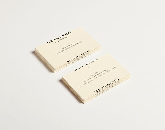 Internationally recognised production company, Revolver, has rebranded with a new identity, brand campaign and website inspired by the industry-standard filmic convention of closing credits.
Created by Sydney brand and design consultancy, Holt, the rebrand marks an affirmation of the company’s reputation in Australia and abroad. Owned by director Steve Rogers and executive producer, Michael Ritchie, Revolver’s award-winning work includes some of the world’s largest advertising productions, such as Baz Luhrman’s Nicole Kidman epic for Chanel, and commercials for clients including Nike, McDonalds, Boags, Nissan, VB, Bupa, Subaru and Devondale.
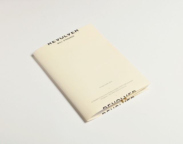 In an initial meeting, Rogers, Ritchie and long-time collaborator Christopher Holt, creative director of Holt, ruminated on flip books. First invented in the 1860s and one of the earliest forms of the motion picture, flip books feature a series of pictures that vary gradually from one page to the next, so that when the pages are turned rapidly, the pictures appear to animate by simulating motion. The idea for an identity that was in flux, implying a sense of
  continuous motion, was born.
The result is a new logo that sees the company name, Revolver, always cut in two. Two thirds of the word appear at the top of the space with the remaining third at the bottom, revolving around a central axis. The device creates an illusion of motion, of a credit roll moving up on a screen.
Rendered in a contemporary, but classic all-caps sans serif font, founders Grotesk by New 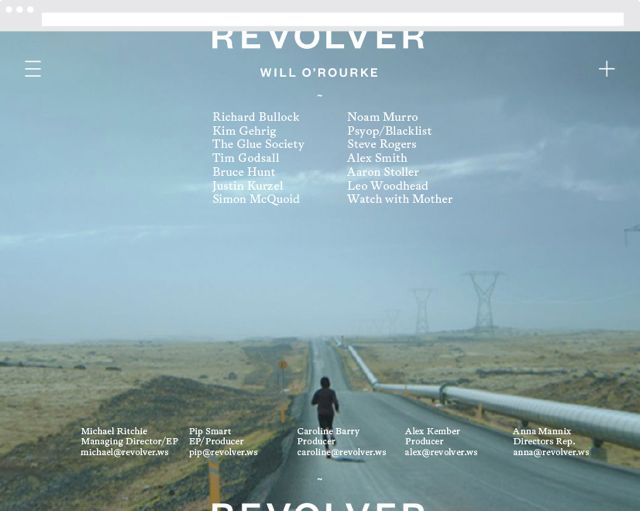 Zealand typographer Kris Sowersby of Klim Type Foundry, the identity also employs a secondary font. Henrik Klubel’s serif Antwerp, out of London’s A2 Type foundry, introduces a sense of dialogue, with a style of type reminiscent of 20th Century novels.
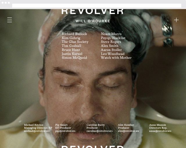
The idea of the credit roll is also used on the company’s new Holt-designed website, where it becomes the site’s navigation. Upon landing on the Revolver homepage, the visitor is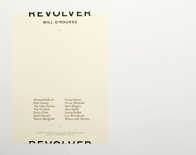 greeted by a full bleed image from one of the company’s productions, over which rolls the new identity and ‘end credits’ listing Revolver’s roster of directors. Clicking upon the credits will navigate the visitor to each director’s reel, or left unclicked, the credits will roll ad infinitum.
The new brand will launch internationally with a print, online and direct marketing campaign, introducing the new identity, listing Revolver’s roster of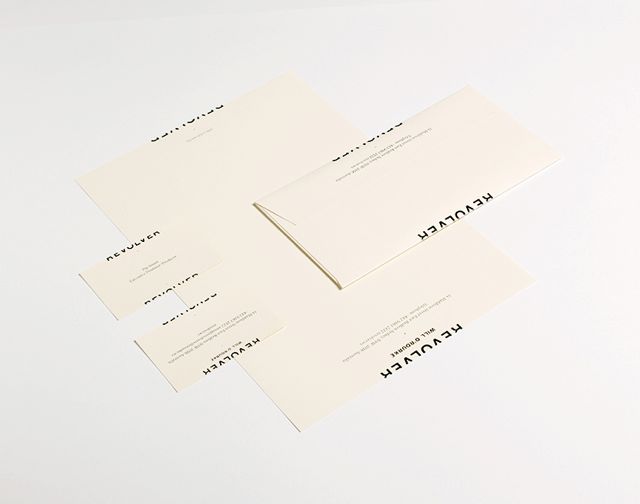 talent and showcasing the credit roll concept. Holt have also rolled out corporate collateral, promotional marketing material including screen-printed posters and a suite of branded on-set materials such as call sheets, director’s treatments and story board templates. A number of applications will see Revolver’s sister company, Will O’Rourke, integrated with the identity.
Holt says the creative challenge of the project was to embed motion into the work in a tangible and engaging way.
Says Holt: “As a company which makes film, the idea of an identity which would evoke a feeling of movement in both digital and static formats had real currency. Revolver’s new brand creates a graphic illusion of motion, giving a sense that something has come before and will come after what is immediately before the viewer.”
Revolver was also looking for an identity that was imbued with an idea, said Rogers.
Says Rogers: “Michael and I wanted to find a way to make our livery less static. It seemed to make sense for a company that spends its time creating moving images that this was reflected in the way it presented itself. The idea of the credit roll was something Christopher brought to us and that seemed to make a lot of sense, because even as a still image it was suggestive of something outside the frame, of something to come.”
